Cover art: When downloading new albums, I usually hunt down the album cover as well. Previously, artwork only showed up optionally in the lower left, in the iTunes screensaver, and on recent iPods. With iTunes 7, Apple has made cover art central. iTunes will now try and retrieve cover art automatically when adding new music, and you can force it to look for artwork of existing tracks with a Ctrl-click. But success is spotty, and you get no feedback if the search was unsuccesful. My guess is that the artwork comes from the iTMS database. But I’ve got albums I know are in iTMS but for which iTunes 7 still fails to retrieve artwork. Looks like this will continue to be a largely manual thing. Meanwhile, two new views in iTunes 7 feature artwork prominently. An album list view shows large versions of artwork along with track listings, and a fancy new “flip” (Coverflow) view uses Quartz to simulate a stack of LPs to sort through:

I like that they’re doing what they can to keep some trace of the album cover experience, but not sure how often I’ll use the feature. Especially since gathering artwork for 95% of my stuff looks like it’s going to remain labor intensive.
Cover art update: Just figured something out. iTunes isn’t doing the normal thing and putting cover art into the ID3v2 data area of music files – it’s storing it in subdirs of ~/Music/iTunes/Album Artwork . I had wondered why it used to take 20 seconds or so to write album cover data into every track of an album, but that it suddenly seems to happen really fast. Apparently the speedup is because iTunes doesn’t have to alter every file – it just stores the art files as external .itc files (i tunes cover?) and associates the images in the library. This is nice for speed and nice for not swelling library sizes, but sucks for portability between machines/platforms. Why isn’t this a preference? Or an optional mechanism to “permanently store art inside music files?” I’ve posted about this in my O’Reilly Mac blog, which has sparked a thread.
Genre view: Is gone. The new widget for accessing the Coverflow view replaces the old Browse icon, which used to let you sift and sort your collection by artist, year, album, or genre. In other words, Apple has replaced a whole lot of functionality with eye candy, which is annoying. You can still do era and genre tricks with Smart Playlists or via search (which is generally very effective), but hate to see the Browse view … hang on, I’m an idiot. They’ve just moved the Browse icon from the top right to a subtle gray replacement icon at the lower right; it’s been demoted, not removed.
New scrollbars: Mixed feelings. The “solid” look is kind of refreshing in comparison to the usual Aqua gel-cap look, but what is it with Apple ignoring the HIG and experimenting with new interface looks all the time? Does this portend a global change to Aqua, or are they just monkeying around to gauge reactions? To change the look of scrollbars in one app and leave the rest of the OS with glow-y scrollbars feels weird. Maybe they’re just treating the early adopters user base as a guinea pig farm; releasing the UI change into a single app, then watching blogs and mailing lists to see how the world reacts.
Multiple libraries: Long overdue – You can now divide your library into multiple libraries and manage them separately, which is useful for people sharing a single login, or if you want to move just part of a collection to another machine, or if your library is so large it causes performance problems. I really expected to see this in iPhoto before iTunes (it’s been possible with 3rd party utils forever).
Update: Check out Dan Sandler’s dissection of the new UI, in high-res PDF or low-res JPG.

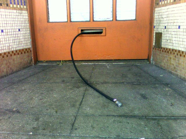 This makes me happy. Bicycle air hose snaking out the mail slot of The Missing Link bicycle cooperative on Shattuck in Berkeley, free for the taking (shot with phone cam). Unfortunately, if you have Presta valves, you still have to go in the store to use the adapter, but they’re always cool about it. They even have a bike mount in the shop for public use so you can get your ride up in the air to work on. No need to ask, just go for it. Unfortunately, if you do need repair work done, you’re going to have to wait for the love – asked about a drop-in tune-up today and walked out with an appointment card for October 4.
 Just-launched