The little music writing project I run with some friends, Stuck Between Stations, is now officially three years old. Until yesterday, we were still running with the original design, left over from a time when narrow content columns were in vogue (usability studies still say 420px is the ideal content column width for maximum readability). Trouble is, we run a lot of embedded video on the site, and YouTube/Vimeo have increasingly been defaulting to much wider video dimensions since more and more people have high-resolution displays. Web developers started assuming a baseline pixel resolution of 1024 a few years ago.
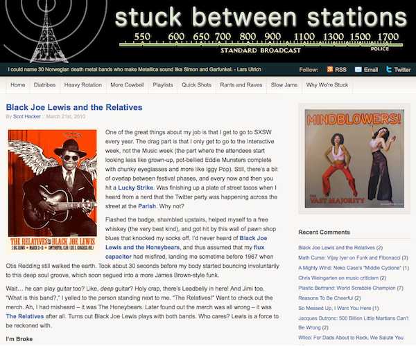
But simply widening the old design wasn’t really an option, since it all hung off a photographic banner image that came with a WordPress theme, and so couldn’t be altered. Decided to chuck it all and start from scratch. Chose the Titan theme as a starting point and went from there. Dug up shots of old radio dials from Google Images and pulled a new banner together, keeping only the broadcast tower from the original design.
Was able to run a series of search/replace operations in the database to increase the size of all the embedded videos already on the site. Interesting to see how many different aspect ratios we had accrued without even trying. Also interesting to see how many of the videos had been “Removed due to violation of terms of service.” Seems like the big publishers have been digging deep in YouTube’s bowels to find and skewer copyright violations, even if they do provide free publicity.
Added a bunch of new features while I was working:
- Random images at top of sidebar
- Twitter integration
- Much better author pages
- Gravatar integration
- Better contact form
- Better comment spam control
- iPhone optimization (try it!)
Pretty happy with the results, though the banner still feels a bit crude to me. We’re no Flavorwire, but without a few dozen more unpaid writers and some Sand Hill investment, this is about as good as it gets for a while. Would love a plug if you’ve got one to give!