Using Leopard for a couple of weeks now – a few more scattered impressions here. Haven’t had time to explore all the nooks and crannies. I spend 95% of my time in Mail.app, TextMate, and FireFox/Safari. Haven’t even launched Time Machine – need to clear a partition on the NAS, and even then, not sure TM is the way to go – we’re pretty happy with SuperDuper for backup, and its images are bootable/restorable, which is something I wouldn’t be eager to give up.
No accident that the Ars review spends the first few pages on UI annoyances. Nice finally to have the look and feel consistent across all apps, but the semi-transparent menu bar is a UI disaster if you use a background with mottled textures, like “stones.” Knew it wouldn’t be long before some kind of hack came out to restore the opacity. Leo ColorBar to the rescue – not only gets rid of transparency, but also lets you tint the menu any color, which I’m liking:
![]()
Ditto for the Dock: I never asked for a mirror. And replacing black “running app” triangles with little glow lights? Cute, but I was tired of them in a couple of days. All gratuitous eye candy. TigerDock lets you return the Dock to something closely resembling… the Tiger Dock. Dock Delight gets your triangles back.
The one thing I thought I missed the most from BeOS days was having multiple workspaces – I used to keep email and browser on one virtual desktop, photo and video apps in another, etc. Spaces was the single Leopard feature I was looking forward to the most. Somehow, in BeOS, the workspaces concept just worked. The first thing I noticed about Leopard’s Spaces was that, unlike in BeOS, there’s no way to assign different wallpaper or background colors to different desktops – they all look the same. Important visual cue, missing. And BeOS also let you run workspaces at different resolutions, which was a great way to test web designs. Not in Leopard.
But I soon realized that somehow, in the intervening years, the perceived need for multiple workspaces had gone away. Between Expose’, the Dock, Cmd-Tab, utils like QuickSilver, and showing/hiding apps, the Mac offers so many ways to switch apps effectively while keeping the desktop clean that the need was effectively gone. After using them for a few days, I realized that all Spaces was getting me was an additional animation when switching apps. I turned Spaces off.
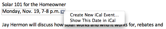
Guess I’m giving the impression of not liking Leopard – but that’s not true. Just getting the annoyances out of the way. Lots to say (mostly good) about changes to Mail.app, iCal, and other features… will save those for another day.