
 A tip from one of the panelists at SXSW, in the CSS Problem Solving session: “If you’re working with CSS and need a good analysis/debugging tool, it doesn’t get any better than Xyle Scope. Mac only, but if you don’t own a Mac, Xyle Scope is a good reason to get one.”
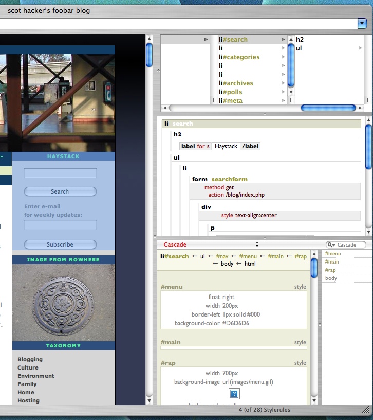
Many CSS designs hide browser discrepancies by allowing white space to overlap, etc. The thing about the current Birdhouse design is that the divs are packed very tightly together, allowing no room for that kind of masking. Tearing out serious hair recently trying to get this style working in all browsers (don’t get me started on MSIE and CSS), with no div overlaps and no fugly gaps. Xyle Scope didn’t magically solve the problem, but it did give me a window onto the primary culprit last night, which I couldn’t have gotten any other way.
If you care:
The problem this template was having that the old MT version didn’t have was that there was a bit of right margin attached to the h2 .nav declaration, which handles the horizontal separators in the sidebars. In compliant browsers, that margin was clipped by its bounding box, but in MSIE, it was rendered, which in turn made its containing box too wide to fit into the 200px sidebar, which in turn pushed the entire sidebar down to the bottom of the page. I had been fixated on padding and margins in the boxes themselves — Xyle Scope helped reveal that the problem lie elsewhere entirely. The WP template I used as a foundation for this design had used h2 .nav in a context where this didn’t matter, so it was a synergistic reaction.
(Screenshot above does not illustrate this problem — just there to show how it reveals all of the inheritances, dimensions, etc.)
I’ve always wondered: what is the point of all this tomfoolery to get CSS positioning working? Why not use tables?
Ross, is that a serious question, or are you trolling? (I’ll give you a serious answer if it was a serious question, really – I just couldn’t tell whether you were just baiting.)
cool tool. thanks for the tip!
No, I’m not trolling. I just don’t see a need for using something with such a badly designed spec. Couldn’t they just have stolen e.g. Java’s layout manager mechanism and used that? Somehow they managed to come up with something new, without a comprehensive set of test cases so that one browser company’s interpretation wouldn’t differ from another’s.
Simple, even trivial stuff is overly complicated in CSS. And complicated things require excessive amounts of code and deep understanding of their model. It neither satisfies the layout needs of professional designers (not programmers pretending to be graphic artists), nor is it human-readable or elegant. Considering they had a clean slate, I really wonder who the dimwits were that came up with the spec.
Here’s a great article from the cantankerous jwz (of the original Netscape fame) on the vagaries of CSS http://www.livejournal.com/users/jwz/193866.html
Choice quotes:
Zeldman has 5 pages on how to do a two column layout (without a footer), and another site refers to a three column layout as “the holy grail”. Last I checked, the holy grail was a legendary and powerful artifact, a label not rightfully applied to a layout any idiot could learn to make with tables in 3 minutes of reading the docs. The three column layout isn’t considered impressive because it should be, it’s considered impressive because CSS layout makes it hard and the people who use it have the lowest of ambitions.
I honestly don’t see how CSS sucks less. It’s just different. It’s not simpler, it’s not more expressive, it’s not more concise, it’s not more portable, and it also appears to not do better separation of semantics/presentation.
Oh right, it lets you do pixel-based layout. Um, yay?
Have you noticed that when you post to LiveJournal and do , the font actually gets bigger? Feel the love as the Mozilla people mark my bug report Resolved Invalid. This is because the FONT tag, when used to request a font “one tick smaller than the current size” has no knowlege of what the current CSS font size is — and they claim this is the right and sensible thing! …
Let me say that again, because I still can’t really fathom it: they think that the current behavior, of asking for a smaller font and getting a bigger font, is the correct behavior.
That should be:
Have you noticed that when you post to LiveJournal and doNeed a preview button!
Should be:
Have you noticed that when you post to LiveJournal and do [FONT SIZE=”-1″], the font actually gets bigger?
Ross –
First of all, I totally agree that some things that should be easy with CSS are not, and the 3-column layout is a great example of that. But JZW is focusing on a few examples of things that are unnceccesarily difficult, and not talking at all about all the things CSS gives us that take us light years beyond where we were.
In all systems, increased flexibility results in an increased learning curve. There are a thousand things I can do at the unix command line that I can’t do in any GUI, but it took a learning curve to get there.
As for browser vendor’s implementations differing from one another, that’s just going to happen, no matter what spec you adopt. That’s just the free market and the standards process working together/against each other in a continuous tension.
nor is it human-readable or elegant.
I strongly disagree on that. CSS is extremely elegant, and more readable than “old school” styling inside the document.
We work hard to overcome the few places where CSS isn’t perfect because it’s worth it. I don’t know what JZW means by this:
it’s not more concise, it’s not more portable, and it also appears to not do better separation of semantics/presentation.
Portability is the whole idea, and CSS gives you that, in spades. And I have no idea what he means by it not doing better separation of semantics and presentation. That’s what it’s all about, and it gives you that, in spades. That’s crazy talk.
The font size example is absurd. When you try and mix the two systems, you’re going to get some unexpected results. If you’re dealing with a CSS design, then use CSS for font sizing! Don’t go throwing some five-year-old deprecated crap into the mix and expect it to just work.
CSS has its foibles, but it also makes our lives immensely easier, and allows for a range of design possibilities that were not possible before. It lets us move every sidebar on our 2000-page site from the right to the left side of the page with one keystroke (try that with tables). It makes site redesigns vastly easier. It makes stuff like this possible. It gives us vastly better accessibility for the blind. It makes DOM scripting workable/sensible. It reduces page weight dramatically. And so on and so on.
Those kinds of things should be axiomatic by this point. Table-based layout and font tags were deprecated almost five years ago now. The CSS system isn’t perfect, but it’s a whole helluva a lot better than what we had. On that there’s very little disagreement. Which is why I wasn’t sure whether your original question was a troll or not.
Re: Preview — Ask and you shall receive. Kind of odd that it takes a plugin to do this in WordPress — seems like an option that should be built in, but there you go….